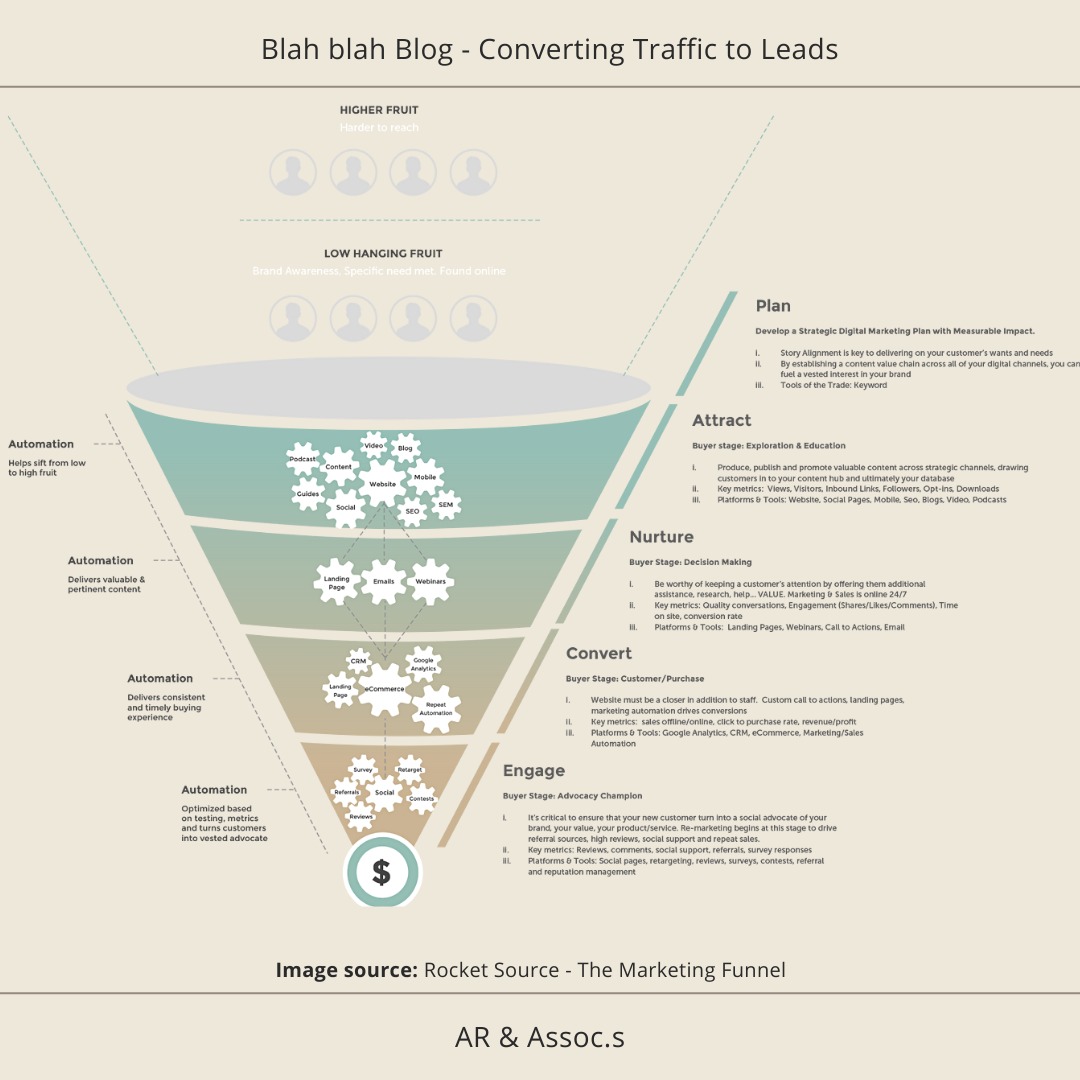
So great news that you have traffic coming to your website, visiting your recently posted news and window shopping around your site, shall we say but you are still not getting the enquiries/ purchases.
Here below is a quick check list that may help you along the way….
- Is your blog resonating with your target audience?
- Is your website clear, concise about what you do?
- Do you have separate landing pages designated for each of your specialty? (Answering the visitor’s question on why they should work with you and how you will meet their needs, etc.) Each landing page should have everything relating to that genre and an easy, convenient click to inquire option.
- Ensure your website is mobile responsive… over 80% traffic is from mobile users.
- Have great content, easy to read, organised, clear, don’t get too bogged down with your technical abilities, certifications… etc appeal to them by how their experience is going to be with you and use ’you’– as though you are reaching out to them personally.
- Spread out your images and mix it in with your content.
- Have clear call to actions – clearly displayed with a very easy explanation what your visitor needs to do. The best way to do this is to have call-to-action buttons with contrasting colours.
- Put testimonials on your website– a reason to trust you.
- Add previous projects with images – a great show and tell. (Make this easy for the visitor with again, an accessible call to action option).
- About you – a short intro on who you are…and what they get from you.
- FAQs page – to answer as many of those pre-empted questions that you think you are going to receive from potential customers.
- Have an exit intent pop-up – if used wisely can be your last effort to keep them from leaving – your site senses the mouse leaving quickly. For more about this https://wisepops.com/how-to-create-the-best-exit-intent-popup-that-instantly-converts/.
- Use Heat Maps –handy for understanding where your site is doing well and what can be improved. Key benefit to using a heat map on your website is to analyse if your visitors are going to where you want them to take. Are they stopping and reading the sections you find most important.If not then actions can be taken in the layout/ design i.e. the font- make it stand out more or use contrasting colours. For more information on this https://www.hotjar.com/heatmaps/
Thanks for reading AR &Assoc.s contact usfor more information on how we could help you.
